Quality Management Techniques
There are several techniques that can be used in the quality planning process but it is very unlikely that any individual project manager would be expected to be skilled in using all of them.
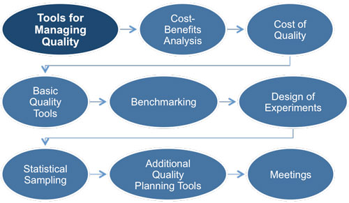 |
A better approach would be to have an appreciation of what each one involves and then to select those that best suit the project and delegate the work to project team members who have expertise in that technique.
A cost-benefit analysis is by far the most important decision making tool and involves nothing more than common sense and judgment based on experience. All quality management activities have a related cost and that cost must be justified in terms of benefit to the project sponsor and the organization as a whole.
No activities should be performed that would equal or cost more than the expected benefits. It should show that the level of quality is viable from a cost perspective and justify its inclusion in the quality plan.
The cost of quality includes all costs incurred over the life of the product and looks at the costs of conformance to quality standards and the costs of nonconformance.
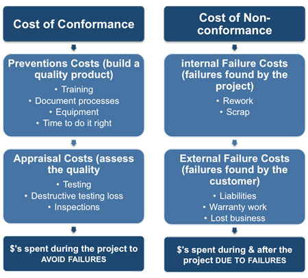 |
For example, the proposed quality standard for the production of a metal pressing might mandate a tolerance of 1mm. In other words the finished part can be up to 1mm bigger or smaller than the specification.
The costs of conformance include both the prevention and appraisal costs incurred in conforming to this standard (Training, equipment, additional time, testing and inspections).
The costs of nonconformance include internal and external costs that would be incurred if this quality standard were not achieved. These would include the costs of reworking or scrapping the failed parts (internal cost) and the costs associated with sending out parts that were unacceptable to the customer.
Project decisions can impact operational costs of quality as a result of product returns, warranty claims, and recall campaigns. Therefore, due to the temporary nature of a project, the sponsoring organization may choose to invest in product quality improvement, especially defect prevention and appraisal, to reduce the external cost of quality.
Most of the techniques described here are based on statistical analysis and are most appropriate where the project deliverables are products that can be measured in some way. For example, If parts are being produced on a production line then it will be straightforward to measure dimensions, tolerances, failure rates, etc. However, many project deliverables are not like this and it is not possible to collect this type of data. For example, anything that provides a user 'experience' can be difficult to measure in this way.
The best approach is to be aware of what tools and techniques exist and to select those that are appropriate for the project you are working on. It may even be possible to adapt some of them in order to provide useful data about quality even if you are not making a product that can easily be measured.
1. Cause and Effect Diagrams
Also called Ishikawa diagrams or fishbone diagrams, they illustrate how various factors might be linked to potential problems or effects. Factors are usually grouped into major categories as shown:
• People - Anyone involved with the process
• Methods - How the process is performed including: policies, procedures, rules, regulations and laws
• Machines - Any equipment, computers, tools, etc. required to accomplish the job
• Materials - Raw materials, parts, pens, paper, etc. used to produce the final product
• Measurements - Data generated from the process that is used to evaluate it's quality
• Environment - The conditions, such as location, time, temperature, and culture in which the process operates
This is not a statistical technique and is therefore applicable to almost all types of project. It does have its critics precisely because is not quantitative and requires a lot of subjective analysis and judgment.
It's strengths are that it can help you to make sense of a situation where there are a lot of variables that are interacting with each other, none of which are quantifiable. It is also a powerful visual tool when you are trying to explain your analysis to others.
2. Flowcharts
This is a graphical representation of a process showing the relationships among process steps. There are many styles, but all process flowcharts show: activities, decision points, and the order of processing.
Flowcharting can help the project team anticipate quality problems that might occur and this awareness can result in the development of test procedures or approaches for dealing with them.
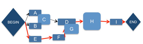 |
A flowchart is common type of chart that represents an algorithm or process, showing the steps as boxes of various kinds, and their order by connecting them with arrows.
There are many different types of flowcharts, and each type has its own repertoire of boxes and notational conventions.
The two most common types of boxes in a flowchart are: a processing step (usually called an activity) that is denoted as a rectangular box, and a decision, which is usually denoted as a diamond.
Flowcharts are used in designing and documenting complex processes. Like other types of diagram, they help visualize what is going on and thereby help the viewer to understand a process, and perhaps also find flaws, bottlenecks, and other less-obvious features within it.
3. Checksheets
These are also known as tally sheets and may be used as a checklist when gathering data. They are used to organize facts in a manner that will facilitate the effective collection of useful data about a potential quality problem and are especially useful for gathering attributes data while performing inspections to identify defects.
4. Pareto Diagram
This is a special type of histogram where the values being plotted are arranged in descending order. The graph is accompanied by a line graph that shows the cumulative totals of each category.
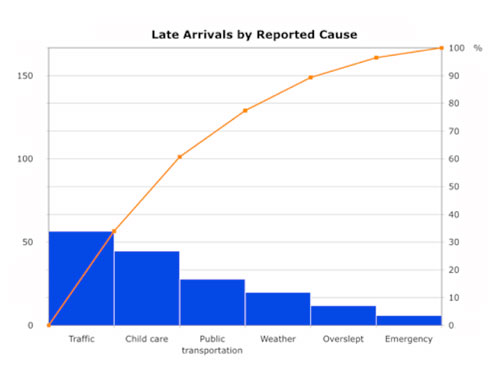 |
Left vertical axis shows the frequency of occurrence, cost or other important unit of measure.
Right vertical axis is the cumulative percentage of the total.
In quality control, the Pareto chart often represents the most common sources of defects, the highest occurring type of defect, or the most frequent reasons for customer complaints, etc. The Pareto chart was developed to illustrate the 80-20 Rule, which states that 80 percent of the problems stem from 20 percent of the various causes.
5. Histogram
This is a vertical bar chart showing how often a particular variable state occurred, with the height of each column representing the relative frequency. Histograms are useful when presenting project data to stakeholders as they can give a clear indication of which problems are the most important to tackle.
6. Control Charts
These answer the question: 'Is this process variance within acceptable limits?' The pattern of data points on a control chart may reveal random fluctuating values, sudden process jumps, or a gradual trend in increased variation. By monitoring the output of a process over time, a control chart can help assess whether the application of process changes resulted in the desired improvements.
When a process is within acceptable limits it is in control and does not need to be adjusted. Conversely, when a process is outside acceptable limits, the process should be adjusted. Seven consecutive points above or below the central line indicate a process that is out of control. The upper control limit and lower control limit are usually set at (plus or minus) three Sigma, where one Sigma is one standard deviation.
Although used most frequently to track repetitive activities required for producing manufactured lots, control charts may also be used to monitor cost and schedule variances, volume, and frequency of scope changes, or other management results to help determine if the project management processes are in control.
7. Scatter Diagram
These use Cartesian coordinates to display values for two variables for a set of data. The data is displayed as a collection of points, each having the value of one variable determining the position on the horizontal axis and the value of the other variable determining the position on the vertical axis. A scatter diagram can suggest various kinds of correlations between variables with a certain confidence level. Correlations may be:
A) Positive (rising) - If the pattern of dots slopes from lower left to upper right, it suggests a positive correlation.
B) Negative (falling) - If the pattern of dots slopes from upper left to lower right, it suggests a negative correlation.
C) Null (uncorrelated).
A line of best fit can be drawn in order to study the correlation between the variables. One of the most powerful aspects of a scatter diagram is its ability to show nonlinear relationships between variables.
8. Benchmarking
Benchmarking is simply a quality standard reference that is used for the current project. This may be a benchmark used within the performing organization, or one that is used across a specific industry. It involves comparing actual or planned project practices to those of comparable projects to identify best practices, generate ideas for improvement, and provide a basis for measuring performance. The value of using this technique is to compare the current project's quality standards with those of other similar projects.
9. Quality Meetings
Meetings involve people who are responsible for quality management including the project manager, the project sponsor, selected project team members, selected stakeholders, anyone with responsibility for any of the quality management processes, and others as needed. Collective decision-making is very important area of project management that can make or break this part of the project. Almost all of the processes that for part of project time management will involve meetings between the project manager, the team and other stakeholders in order to make decisions about the activity definitions and associated estimates. How well these meetings are conducted will have a major impact on how smoothly the project runs.
If you feel as though your project meetings could be improved then you can download the 'Meeting Skills' eBooks from this website. These free eBooks cover all aspects of meetings including how to set an agenda that will ensure that the meeting achieves it's aims and how to chair a meeting so that it is as productive as possible.
You may also be interested in:
Managing Project Quality | Quality Management Techniques | Project Quality Management and ISO Quality Management | Quality Assurance | Quality Control | Testing Project Deliverables | Quality Audits | Post-Implementation Audits.
|
|